Program Diversity and Persistence Use Case / Dashboard
Educator Preparation Programs (EPPs) are committed to increasing the number of teacher candidates who complete their programs and earn certification. By analyzing data on how different candidate groups progress through key milestones, EPPs can identify trends, set improvement targets, and tailor supports. These insights are essential for driving equity, enhancing program effectiveness, and ensuring more candidates are prepared to enter the classroom. Access the Educator Preparation Ed-Fi Backed Tools: Program Diversity and Persistence Use Case Resource, to learn more about this use case and the related essential questions.
In supporting the EPP Community to access these insights, Ed-Fi has developed a field-informed solution backed by the Educator Preparator Data Model (EPDM) with a sample PowerBI dashboard providing three visualizations: Candidate Summary, Program Completion Rate by Race, Certification Rate by Race.
The sample dashboards in the source code repository above were built for Ed-Fi Data Standard 4.0 and may require additional modification for newer versions of the Data Standard.
Candidate Summary
Candidate Summary User Story
As a user in a program administration personnel role, I want to view a breakdown of all candidates in my program by different attributes in order to get a snapshot of how diverse the candidate population is.
Candidate Summary Report View
The Candidate Summary page provides a breakdown of candidates by race, sex, and grade level. The page also includes a visual that shows the number of educator candidates in the pipeline from enrollment through certification.
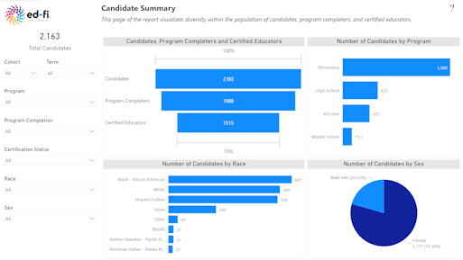
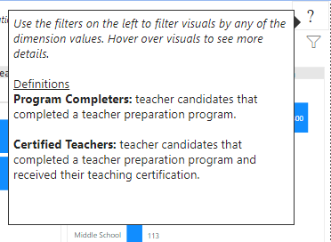
Use the filters on the left to filter all visuals by different attribute values. Hovering over the "?" in the top right corner shows a tooltip of useful definitions. This tooltip can be edited by editing the Tooltip page in the report.
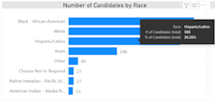
Hovering over visuals provides more information on the data being presented. For example, hovering over the "Number of Candidates by Race" visual shows a tooltip that includes the percentage.
Program Completion Rate by Race
Program Completion User Story
As a user in a program administration personnel role, I want to know if receiving a grant is related to higher program completion rates. I would like to track varying candidate populations through the educator pipeline to ensure equitable access and support it provided.
Program Completion Report View
The Program Completion by Race page includes 3 visuals.
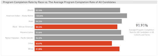
The first visual provides a breakdown of the program completion rates by race and compares these rates to the average completion rate of all educator candidates. If the completion rate of a racial group is below average, the bar will be red. If the rate is at or above average, the bar will be gray.
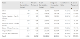
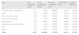
The second visual summarizes the number and percentage of educator candidates, the program completion rate, the certification rate, and the percentage of educator candidates that received a grant by race in a table. The purpose of this table is to provide summarized numbers for users that prefer seeing numbers displayed this way instead of a chart.
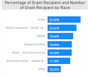
The final visual sorts the percentage of each race that received grants from highest to lowest. Looking at this visual along with the program completion rates visual should help us answer the question of whether there is a relationship between receiving grants and completing a program.
Certification Rate by Race
Certification Rate User Story
As a user in a program administration personnel role, I want to know the difference between program completion rate and certification rate by race.
Certification Rate Report View
The Certification by Race page includes 3 visuals.
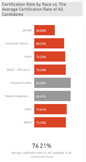
The first visual provides a breakdown of the certification rates by race and compares these rates to the average certification rate of all educator candidates. If the certification rate of a racial group is below average, the bar will be red. If the rate is at or above average, the bar will be gray.
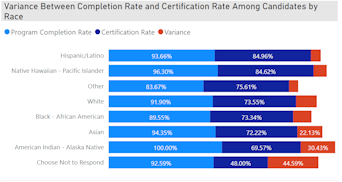
The second visual compares the program completion rates with certification rates and provides the variance between the two. The purpose of this visual is to see the percentage of educator candidates that fall out of the pipeline from program completion to certification.
The final visual summarizes the number and percentage of educator candidates, the program completion rate, the certification rate, and the percentage of educator candidates that received a grant by race in a table. The purpose of this table is to provide summarized numbers for users that prefer seeing numbers displayed this way instead of a chart.
For implementation guidance, see the Program Diversity and Persistence Dashboard reference documentation.